About the Application Comparison Dashboard
The Application Comparison dashboard displays on the first page when you log on to Unite. As illustrated in the picture below, the Application Comparison dashboard provides insights related to decisions and current statuses for applications in the current admissions cycle.
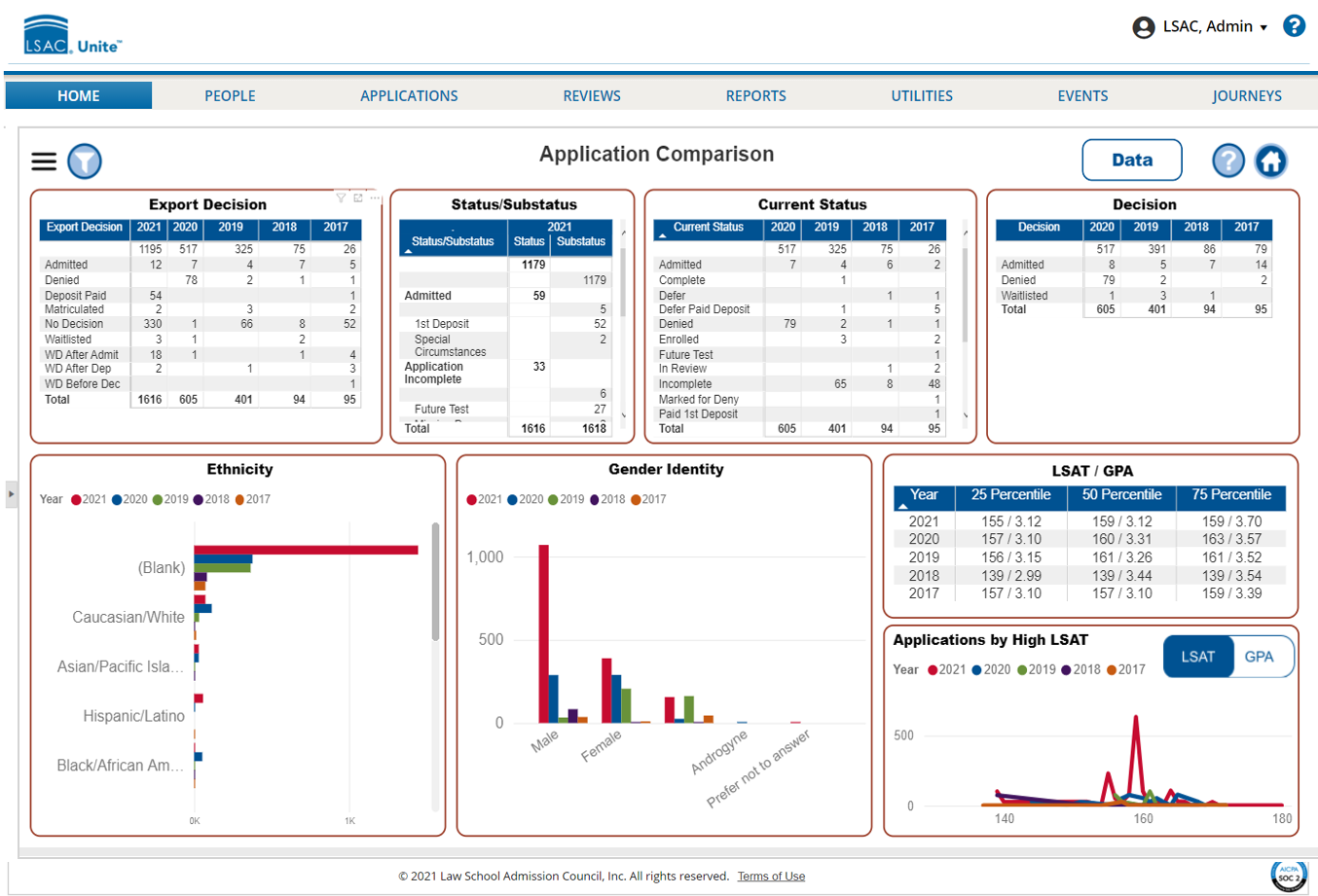
The eight tiles that are pinned on the Application Comparison dashboard provide current day numbers along with a year-over-year comparison (up to 5 years to the previous day). The following table provides a description of each tile on the dashboard.
| Tile | Description |
|---|---|
| Export Decision | This tile contains a table that shows the number of applications for each of the export decisions over the previous five years. |
| Status/Substatus | This tile contains a table that shows the number of applications for each status and substatus combination as of the current day. You can also see a total for the number of open applications in Unite. |
| Current Status | This tile contains a table that shows the number of applications for each current status over the previous four years. |
| Decision | This tile contains a table that shows the number of applications for each decision status over the previous four years. |
| Ethnicity | This tile contains a bar graph that shows the number of applications by ethnicity over the previous five years. |
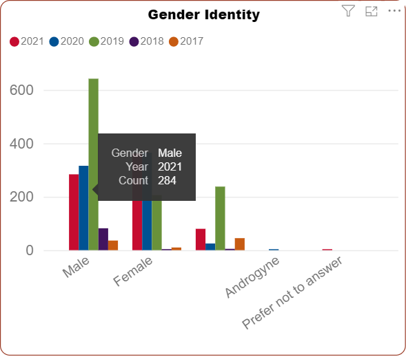
| Gender Identity | This tile contains a bar graph that shows the number of applications by the gender with which applicants identify over the previous five years. |
| LSAT / GPA | This tile contains a table that shows the 25^th^, 50^th^, and 75^th^ percentile for both LSAT and GPA. |
| Applications by High LSAT | This tile contains a line graph that shows the distribution of high LSAT scores across all applications over the previous five years. |
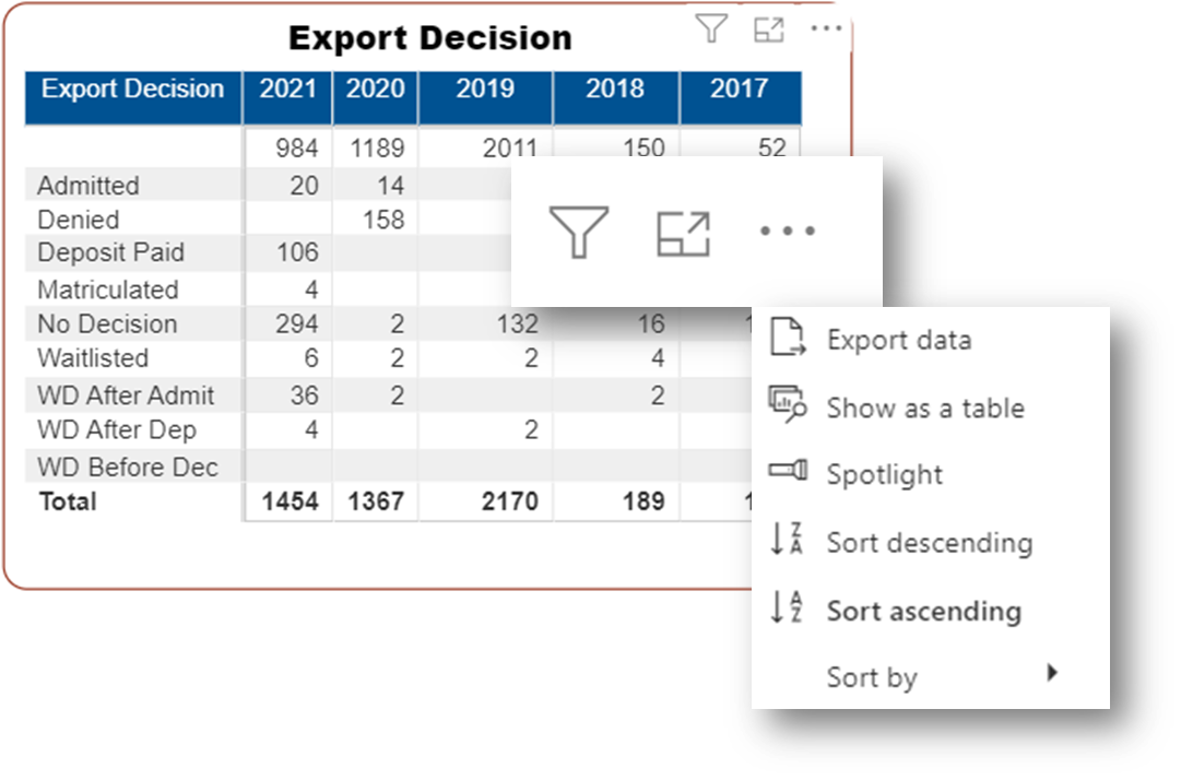
The tiles on the dashboard are interactive. For example, when you hover your mouse pointer over a tile, a tile action menu displays that provides options for you to sort, filter, and focus on the information. Depending on the tile, all or only a few options illustrated in the picture below may be available.
The following picture illustrates another way to interact with tiles on the dashboard. Hover your mouse pointer on any bar or line to see the specific numbers associated with the visual.